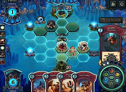
Hi, recently I’ve noticed this thing. In Pandora mode, when you want to check card ability in play, it shows card at the right side of the screen. Problem is that text of the card is covered by top section of “power wheel”, specifically by section which shows amount of Pandora shards drawn. Due to this, card is unreadable and it’s highly annoying.
In normal battle mode this is no broblem since top section of power wheel with Pandora shards is not present.
I observe this for aprox. two weeks. Anyone else have same problem?
1 Like

yes, the same for me on ipad air 2. it’s very annoying.
and the deck cards at the bottom of the screen are so clunky and big now that they cover parts of my orb.
these big blocks of cards don’t really fit into the whole beautiful picture.
they seem to overpower the rest of the screen content.
it was looking better before.
Can you guys pls try to fix this issue with the next patch? it’s just a matter of order in overlapping. For new players like me is really annoying, cause we need checking descriptions very often…


