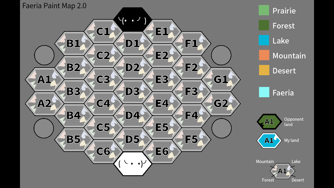
I saw recently a faeria game board with each tile named, so you can refer to a tile with a letter and a number.
I’m not sure I’m expressing myself correctly, so here’s the picture.
Let’s ignore all the cool features on this map and talk about the naming of the tiles. (A1, B2, C4 etc)
The principle of this nomenclature is the following : “Divide the board into columns, each collumn is assigned a letter, then number the tiles from top to bottom.”
It’s really simple. That’s great. But there are some problems:
- Firstly, these columns don’t have a real impact on how the game is played on the board. In other words, we don’t follow these collumns when playing, so they create a representation of the board that isn’t pertinent.
- Secondly, they don’t represent the hexagonal nature of the board either. This makes them unfit for representing the geometrical structure of the board.
- And lastly, the navigation is a bit clunky in my opinion, because only the columns are aligned.
So this system, although simple, is not pertinent nor adapted to faeria’s board.
This system is obviously copied on chess, but it lacks the lines you can easily make on a square board. So I made a new model with lines.
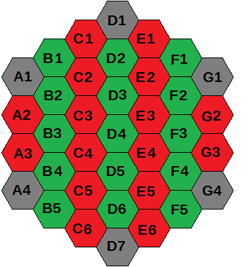
In red and green, columns, obviously. In Grey, wells and orbs. Same numbers are aligned following inverted V lines. It gives this grid in the end:
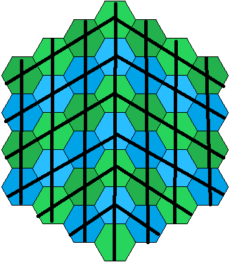
I really don’t like that model, actually, it resolve nothing and I feel like not naming orbs’ and wells’ position is way better and less disturbing for navigation.
Then I came up with a system that solves the pertinence problem:
It’s possible to divide Faeria’s board into five areas. The first two rings of lands around the orbs, the tiles between and near the well, and the central area that’s left. These zones have impact on gameplay. The space around the orbs is where you fight as rush, develop as control, and the space near the wells is where you fight as midrange.
So here’s the model based on this division:
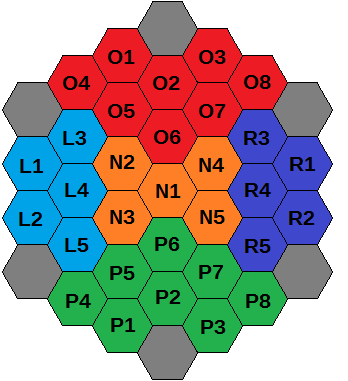
Ok. Explanation is badly needed, actually. Each zone gets a different color. I named the five zones “Protective ; Offensive ; Neutral ; Left ; Right” So each zone have a letter (P ; O ; N ; L ; R) that is not the same as the column nomenclature, wich allow both systems to coexist without ambiguousness.
The numbering is the tricky part. Each zone can be further divided in two, external and internal parts of the area. So I coded this differenciation into the tile names. O1, O2, O3 ; P1, P2, P3 ; L1, L2 ; R1, R2 ; N1 makes their respective zones’ internal parts. This allow symetry and easier orientation. To complete the numbering, I proceded from top to bottom first, then from left to right.
To simplify: “The board is divided into zones. Each zone is given a letter. Each zone is further divided into external and internal parts. The internal parts are numbered first. The numbering is done from top to bottom, then left to right.”
I’ll admit it’s really complex in the end, and that’s the number one problem of this model. But it represent the strategical structure of the board quite well, and is pretty easy to navigate once you’re familiarised with the system, because the approximative location of a tile is coded directly in its name.
Well, this “zones model” isn’t adapted to the geometrical structure of the board either. So let’s trys something else.
The board can be divided into concentric circles. It gives you three rings and a central tile. The two outer rings are composed of 12 tiles, the inner one of 6. Yes, Faeria’s board is a clock.
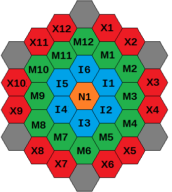
So, X for eXternal ring, M for Middle, I for Internal. And that N1 because I didn’t have any idea for a good letter for the center that wouldn’t conflict with the previous systems, so i reused the same name as the zone model. It’s completely arbitrary.
Note that you can also number the internal ring with even numbers only:
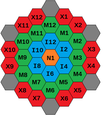
It’s as easy to navigate in the clock model as it is to read… well… a clock. The rings are also quite adapted to Faeria gameplay because it highlights charge 2 paths. This clock representation also fit the hexagonal board. What’s more, the system is fairly simple as well. “Divide the board into rings. Each ring is given a letter. Number them clockwise.”
This were my reflexions on this matter. Adopting pertinent conventions seems important to me. So, what do you think of these suggestions ?
