Hello Faeria artists and players !
— Is the hand-drawn style flying away ? —
I am writting here to ask some things about Faeria’s art. First of all, I would like to say that I’m very fond of the hand-drawn/story-book style of cards pictures : they are full of poetry, and some of them reminds me Miyasaki’s works and also a board-game that is called “Dixit” in France (not sure though how it is called in other countries).
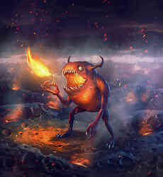
But when I saw June 30th’s update, I started to worry about what the Faeria’s art was going to become. I remember I had the same doubts when I saw the “Flame Spitter” new artwork in one of the previous updates.
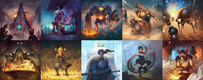
What questions me in today’s update is that, on most of the 10 new artworks, I can’t see this hand-drawn/poetic style that made me so fond of this game first. I reproach these new pictures to be far too much “clean” and generic (don’t know if it’s understandable) : lines are too precise and colors are somehow too raw. I don’t recognize the water-color/pastel-color look of the other pictures. In my opinion, new artworks in June 30th update look too stereotyped, and they lost the charm and the poetry of the previous ones. We can definitely see they were made with a graphic tablet (whereas it wasn’t that obvious in other ones).
And “Flame Spitter” above all : it looks as a 3D model instead of a drawing !
Here are some pictures to let you judge and compare :
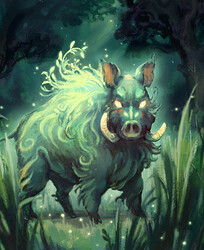
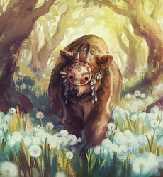
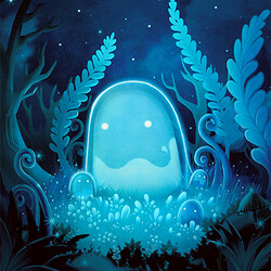
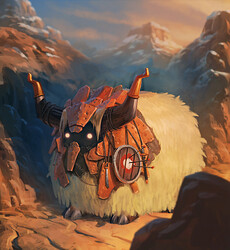
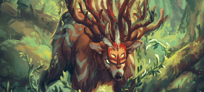
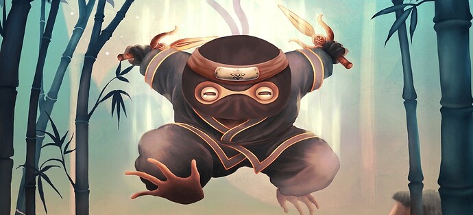
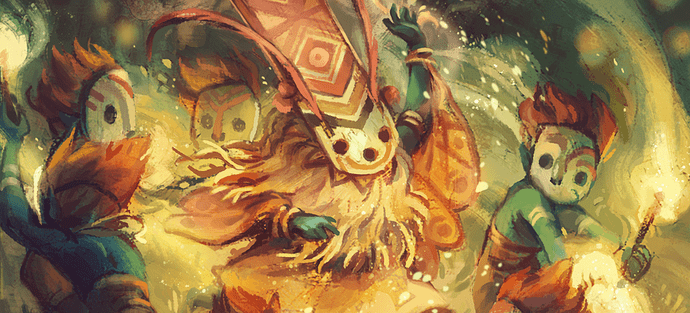
1) The “pastel-color / hand-drawn / poetic” style :
Oh my god ! we could even see the Faeria flowing out of these four…![]() They are so gorgeous that we could think they have been hand-painted or hand-drawn with pastels !
They are so gorgeous that we could think they have been hand-painted or hand-drawn with pastels !
2) The “more generic / not so hand-drawn looking” style
a) Flame Spitter (it looks more as a 3D model to me… ![]() )
)
Where is gone the hand-drawn style ? These picture could be a concept for a 3D monster in a 3D video-game or cartoon, which Faeria is not and shouldn’t try to become !
b) June 30th update - new artworks (most of them obviously in “graphic tablet” style) :
The preparatory sketches / concepts and temporary pictures of these ones surely were great, and choices of composition do look as good as in other cards for me (especially “Barbarian Ogre”, “Bomb Slinger”, "King’s Faithful, and “Rebel Slinger”).
But it seems to me that they have lost some “soul” in the realisation process, mostly because they don’t look hand-drawn anymore… “Khalim’s Follower” looks like in an anime manga now : very far from the yellow cards actual theme ! And others look like in cartoons, very far from the early style of Faeria’s Art, which - to my mind - gave a lot of charism to this game and made it so appealing at the first sight !
Please, dear Faeria Team, don’t loose what makes you special ! Don’t feel forced to look more “professional” and by the same way more generic and “cliché” ! Don’t let fly away the poetry, the charm, and the character you put in the game since its very beginning !
If you, players, want to keep the hand-drawn style of Faeria’s art, you need to say it here ! Unless I am the only one to have this point of view of course…
I know it may be just a matter of taste, but please give me back your feelings about it ![]()
Long life to Faeria and kind regards ![]()
Sukhurmashu
( P.S. Please also forgive my poor english… I’m french ![]() )
)


 !
!


